Homemade
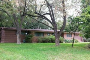
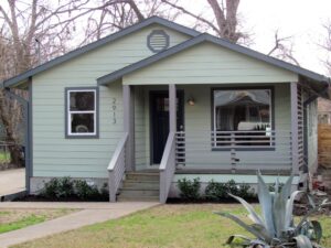
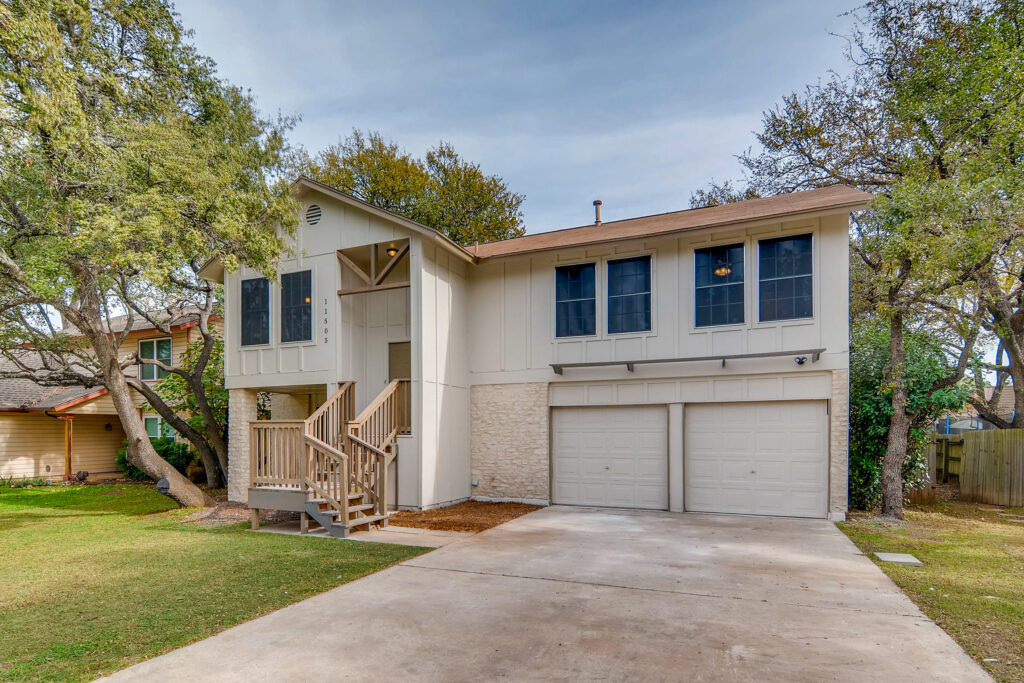
I’m not going to lie. We’re starting this whole website thing off with the Sweet Split-Level because it’s probably my favorite project we’ve done. We took a tired, outdated house with an awkward layout and turned it into a home that is warm, inviting and super livable. #FlipsterGoals
We’ve already profiled the layout updates in our Before and After post so let’s dig into some of the design details.
Here are a few of the elements I just love.
First I think the wood elements we added to the front of the house really give it some character. We wanted to add some farmhouse details to tie in with the new board and batten siding on the front of the house. I think they add just the right amount of interest without being over-powering.
Moving inside- I think the metal railing is a home run. It was a bigger expense (since we had it custom-made on site) but I think it ups the style factor of this house by a zillion. It turns our awkward entryway from a drawback to a selling point. #winning
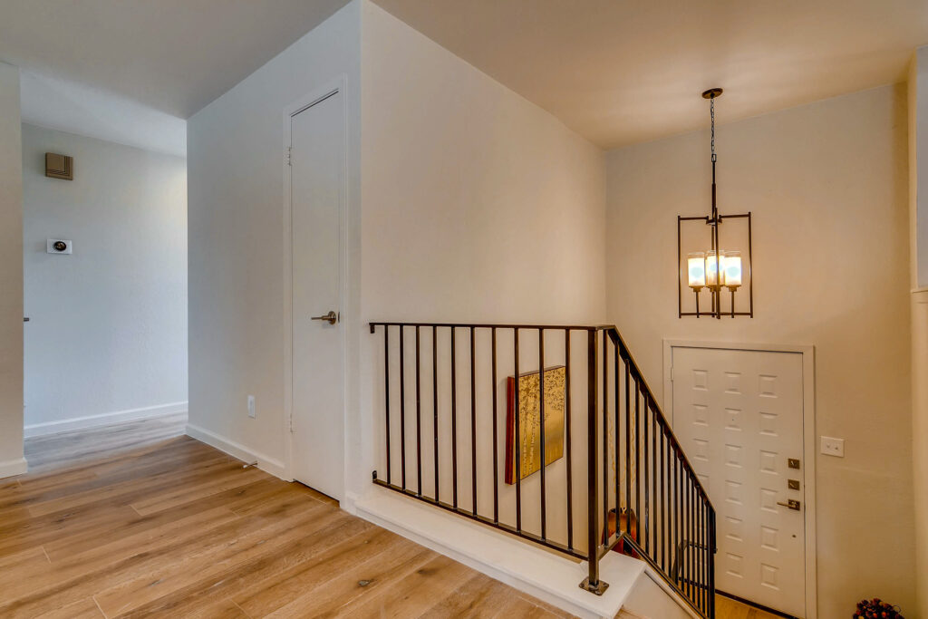
I also love the entryway light we chose-the antique bronze finish plays nicely with the hand rail. As does the price-this baby was a steal at $189 and helped offset the cost of the custom railing.
On to the kitchen. There is so much about this room that I love! First and foremost I’m so glad that we decided to remove the walls between the kitchen and dining and the kitchen and living rooms. It turned this kitchen from a dark and dreary cave into a light and bright space that really serves as the heart of the home.
I’m also glad we decided to replace the solid wood door with an exterior door that lets more light into the space. Natural light is always the best light!
Speaking of lights, I’m loving the pendants we added above the island. I think they have an updated and classic look. Since we needed three of them we wanted to go with something economical and at $150 each these fit the bill!
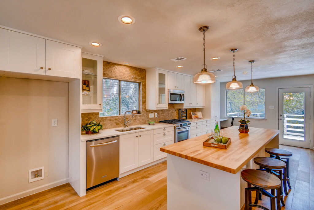
Can we just talk about that butcher block island? It adds style and function at a fraction of the price of stone. If you haven’t caught on yet the Flipsters love a good bargain. The whole name of the game is to add style and appeal at a price point that still makes a profit! That sounds like a no-brainer but it’s very easy to over-design and over-spend! Trust me-there are lots of pretty ($$$) options out there!!
We got our butcher block from carguygarage.com. These guys make all sorts of things to go in car garages. Shhh-don’t tell them we used this in a kitchen! We actually ordered the wrong size initially so now we have two (I smell a giveaway coming up).
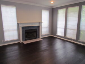
In the living room we did a slurry wash to the stone fire place. This was an inexpensive way to add character and reuse the existing material. By adding a thick mortar coating to the stone we created the appearance of something that looks like it was made much longer ago than the 1980’s!
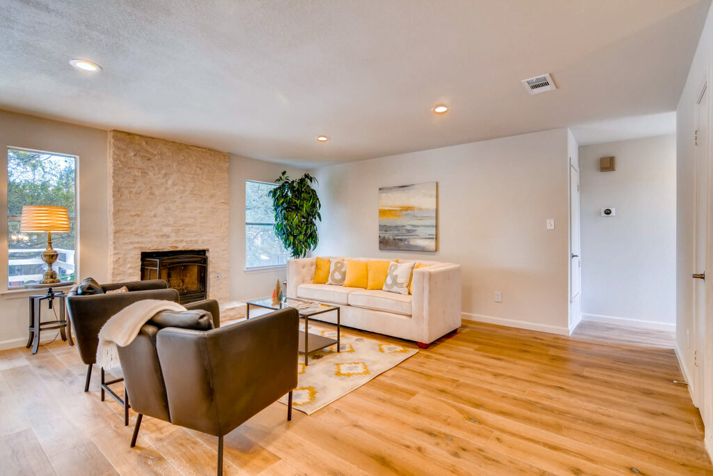
The floors-oh how I love these floors. They are light years better than the white carpet that was in here previously! Once again, these engineered hardwoods did not break the bank, but add so much to the overall look and feel of the home.
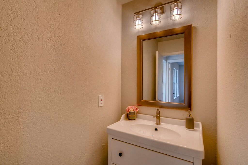
I’m obsessed with this sweet little vanity we put in the powder room. Can you believe it’s from Ikea? One thing that often gets over looked in design is scale. But it is so so important to match the dimensions of your furniture and finishings to the scale of the room. The vanity that was in the space previously stretched from wall to wall and only made the small space feel that much smaller. By scaling the vanity, mirror and light fixture (which by the way how farmhouse fun is it?!) we have helped create breathing room in this small space.
Last but not least the master bath. We love to spend money on kitchens and mater baths. Well we don’t love it-we’re pretty cheap BUT we know that this is where we make our money back and then some so we don’t mind. From a design perspective, spending money is always more fun!
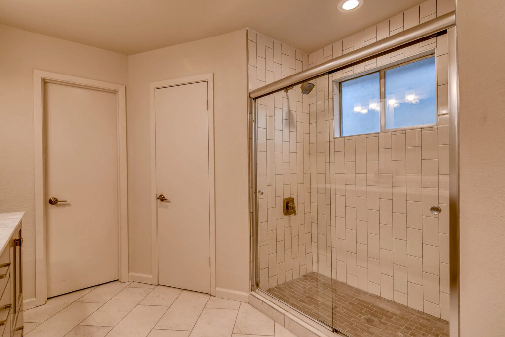
In this master we didn’t have room for a huge walk-in shower, which is what we would have preferred, so instead we added a glass door to help the shower appear much larger than it is. We went with classic subway tiles in on-trend whites and grays to give an updated but timeless look. One thing with flips is you’re always trying to balance what’s on trend with what will have the most appeal to the most buyers. I think we hit that balance just right with this bathroom.
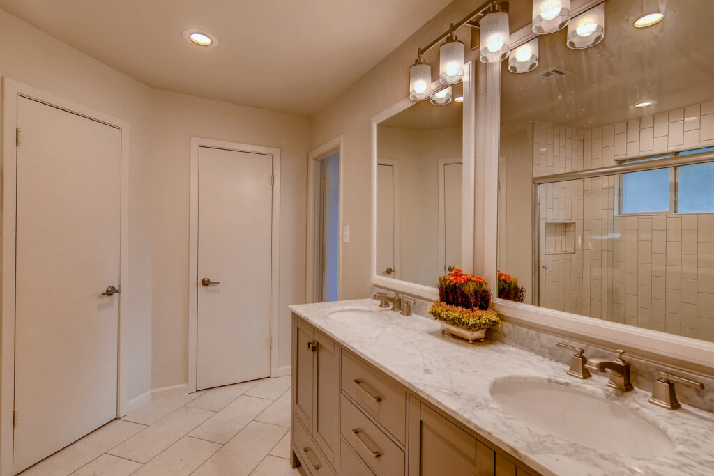
I love the vanity we chose for this space. The marble top gives a classic and upscale feel. We replaced the standard hardware with elongated pulls for a more modern feel. I also love the mirrors we put in this bathroom-it’s actually two standard rectangular mirrors turned on their side.
Overall this house was a fun one to design. Our favorite projects are where we can’t believe it’s the same house once we’re finished and this one definitely falls in that category!!