Homemade
Our first before and after post! And it’s a good one. You won’t believe how this house was transformed.

Located in the Anderson Mill neighborhood of North Austin our Sweet Split-Level provided quite the design challenge. It was built in the early 1980’s and had some, ahem, layout issues.
In a world where open-concept floor plans reign supreme, we knew we had to open this home up as much as we possibly could to give it the functional layout modern home-buyers are looking for.
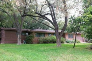
We’ll begin our tour from outside. Our Sweet Split-Level needed a little help in the curb-appeal department. Here she is in all her 80’s jungle-green glory.

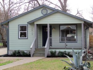
And here she is after:

So much better! We replaced the worn-out front siding with board and batten. We initially only replaced the front siding in order to save some dough and get the most bang for our buck.
*Be sure to tune in to episode 1 of the podcast (coming soon!) to find out what happened when we replaced the rest of the siding at the buyer’s request. Spoiler alert-it was not good and almost killed this deal!*
We also toned down the high-contrast exterior colors by warming up the siding color and accenting it with a neutral trim. We used the same trim color to paint the front door and give the entrance some pop in a much more subtle way than the jungle green trim did!
We added some wood accents to add visual interest incorporating a custom wood trellis above the front entry and above the two-car garage. These elements help to add warmth and character with a dash of farmhouse charm.
We reoriented the stair case and added a flight of stairs to improve the functionality of the home’s entrance.

Some new mulch and freshly-trimmed trees gives a more polished presentation and allows you to actually see the home!
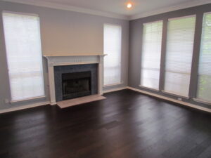
.Moving inside, our first major layout improvement was opening up the entry way.

We opened up the wall between the entry hall and dining room by creating a pony wall. This allowed us to maintain the structural integrity of the house while giving a more open feel. We also added iron handrails and a new entry light to give the home a more modern aesthetic.

Replacing the wall to wall carpet with engineered hardwood floors also opens the room visually and the darker color provides a grounding place for the eye.
Another major layout change we made was removing the walls between the dinning and kitchen and kitchen and family rooms. This allowed not only for a more functional and modern layout but also allowed the natural light from the exterior windows to enter the space. We added a glass exterior door leading to the deck for additional light. White cabinetry replaced the 80’s dark brown cabinets and light quartzite countertops replaced the faux wood counters to give a more modern feel. We added butcher block to the kitchen island for warmth. A small desk was added to the right of the kitchen to make use of an area that had previously been dead space. The result is a compact but efficient living area.
Check out how cramped and dark the kitchen felt before. Hard to believe it’s the same space!

Ah much better:

The master bath was 80’s fabulous with faux marble counters, lots of brown tile and carpet (ewww).

Our updated mater bath features subway tile and a large glass door to make the shower feel much larger than it acually is. We also replaced all hardware to give an updated feel.

The powder room also got an upgrade with a vanity and mirror on a scale more fitting of the small space.
Before:

And after:

We did our best to bring the design and layout of this home more in line with what modern buyers are looking for and the results speak for themselves-we were under contract in 7 days!