In case you haven’t heard, the housing market in Austin is HOT right now. Thanks to an ever- expanding lineup of companies with headquarters here, a large influx of Californians now calling Texas home, and an all around great quality of life many people are clamoring to live in the Texas capital. As home flippers this is obviously good news for us. We’d like to ride this wave as fas as can so as a company we have been in active growth mode. Growth=more flips=more capital needed.
Since rental rates haven’t kept pace with what you can sell a home for here in Austin, Lincoln decided it was time to off-load a house he had been holding as a rental to free up some cash money.
There was only one problem. This house had some outdated features and we weren’t sure how buyers would feel about them. Additionally this was the first property Lincoln ever flipped-way back when it was just a hobby. As such there were some design decisions made that we would do differently now that we have more flips under our belt.
There’s always a learning curve when you do something for the first time and we certainly paid our tuition on this house but we did learn some really great lessons that we have carried with us:
1. Lincoln remodeled this house to fit his taste and what he would want to buy. This is basically rookie house flipping 101. Assuming that your taste is what everyone else is looking for.
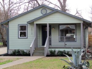
Lincoln was living in downtown Austin at the time and his design choices definitely leaned towards a modern/urban look. Think West Elm with a dash of Ikea. This house is located in a very suburban area. It is a classic builder home with a traditional Texas Hill Country limestone exterior. The buyer of this property may be looking for something more traditional than what we have to offer.
One thing we do now with all our projects is to factor in the neighborhood location, feel and price-point before making our design selections.

Exhibit A: this Ikea light fixture is too modern for our suburban home
2. The design skews dark with masculine vibes. The grey that was picked for the walls is a little dark and the wood-look tile used in the master bath screams “bachelor pad” or “cabin in the woods”-not sure which. This home is definitely a family home so if we were to do it again we would have gone lighter on both the walls and tile selections.

3. Because this was the first flip and a house with a lot of square footage, the budget for the cosmetic upgrades was pretty tight. Lincoln opted to keep some of the original features in order to save some dough. The result is a mix of old and new that is slightly awkward at times.

Added a modern tile backsplash but kept original granite-it kind of works.
In hindsight we should have updated more. Yes- we are big fans of saving money when existing fixtures are workable but you have to weigh the incremental cost with how it will play with your over all look.
We also kept the carpet because it was in good shape and we didn’t have the budget for flooring upgrade. Had budget not been an issue we would have replaced with wood to match floors in main living space giving the whole area a cleaner look. We also would have added rod iron handrails to the staircase for a fresh update.

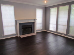
That’s not to say all was lost on this one! The blue penny-tile surround we put in the formal living room is still one of our favorites! We found this tile on Wayfair and could not be more pleased with how it turned out. Check out our Stalk N Shop page for more on the materials used.


We love how this fireplace surround turned out!
Now that we’ve listed the property for sale we want to downplay some of these design choices and we’ve asked Kathleen with Starfish Home Staging to help us make the property as marketable as possible. Watch our Youtube Episode to see how it all plays out!

 Homemade


